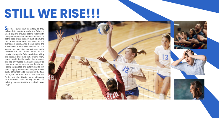
You open your yearbook and in the centre of the page is a large breath-taking photo of the volleyball team’s captain leaping through the air to spike the ball towards the left side of the court. Your eyes shift to the left side of the page where there is a headline that reads “STILL WE RISE” in giant Helvetica fonts. Underneath the title is a block of text that retells the story of the amazing victory the school volleyball team had against their rivals. Surrounding the text and main image are a number of smaller photos displaying the cheers of the audience, the intensity of the coach’s screams and the fiery eyes of the unrelenting players.
This is the way that you have intended the page to be interpreted. The only question is, how do you ensure that viewers will follow the same prescribed path of interpretation? This is where a well thought out page layout becomes important. The page layout is the blueprint and storyboard to the narrative you are trying to illustrate. Yearbook page layouts use design principles like negative space, proximity, repetition, contrast, alignment, and focal points to communicate where the viewers should focus their attention so that they can follow along with the story being told. These design principles provide the framework that directs the planning of photos, headlines, copy and content modules for the yearbook page layout. In the following sections, we will talk about the different design principles and the design components involved in creating an effective yearbook page layouts that will attract and keep the attention of viewers.
Negative Space
Negative space is the empty, blank areas that surrounds the design elements. This space is important because it separates sections, defines the important elements, and provides relief from the multitude of images that would cause information overload for viewers. When there is not enough negative space, the design can feel too busy or cluttered. This can add strain on the viewer and cause them to ignore some of the information so that they can reduce the feeling of being overwhelmed. Good use of negative space in your yearbook page layout will enhance the message and allow it to be easily interpreted. Also, when there isn’t enough negative space, the images may fight for attention causing the main message to be lost in the clutter.
Proximity
This concept suggests that design elements, ideas, and messages, which are related in some way should be grouped together. In contrast, aspects that do not appear to have any relationship should not be grouped together. Proximity accomplishes two things. Firstly, it provides a structure to the yearbook design so that viewers can easily follow the story being presented. Secondly, proximity helps to clearly establish the message that viewers should be focusing on by linking ideas to the main point. Proximity and negative space work together to direct the focus of viewers so that the message can be clearly understood. For example, by grouping quotes together with photos and isolating them from the copy-written text through negative space, viewers can easily process the information being presented. The close proximity of the quotes to the photos enhances the message of the photos, while its distance away from the copy-written text allows the quotes to stand out.